

Reflection
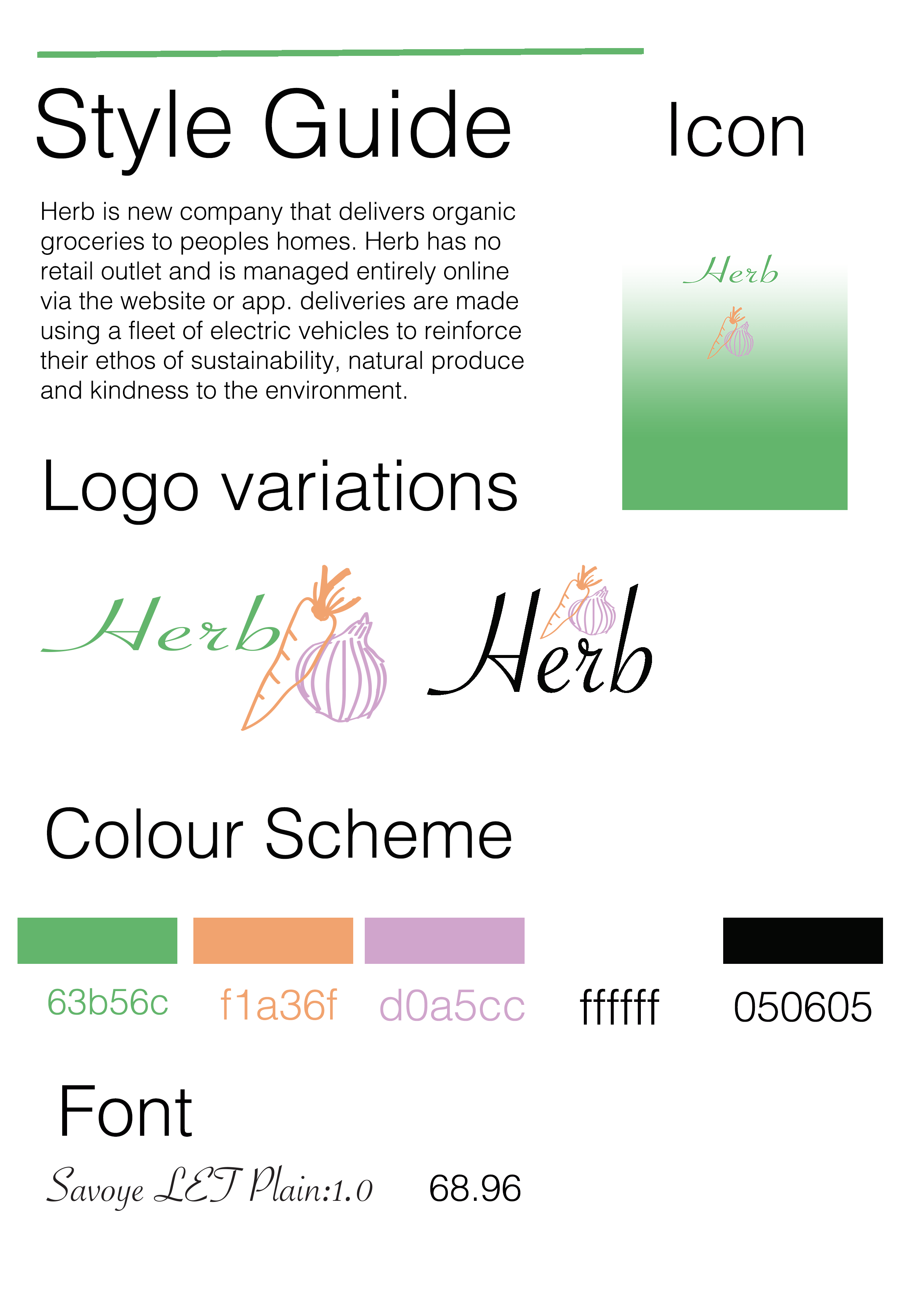
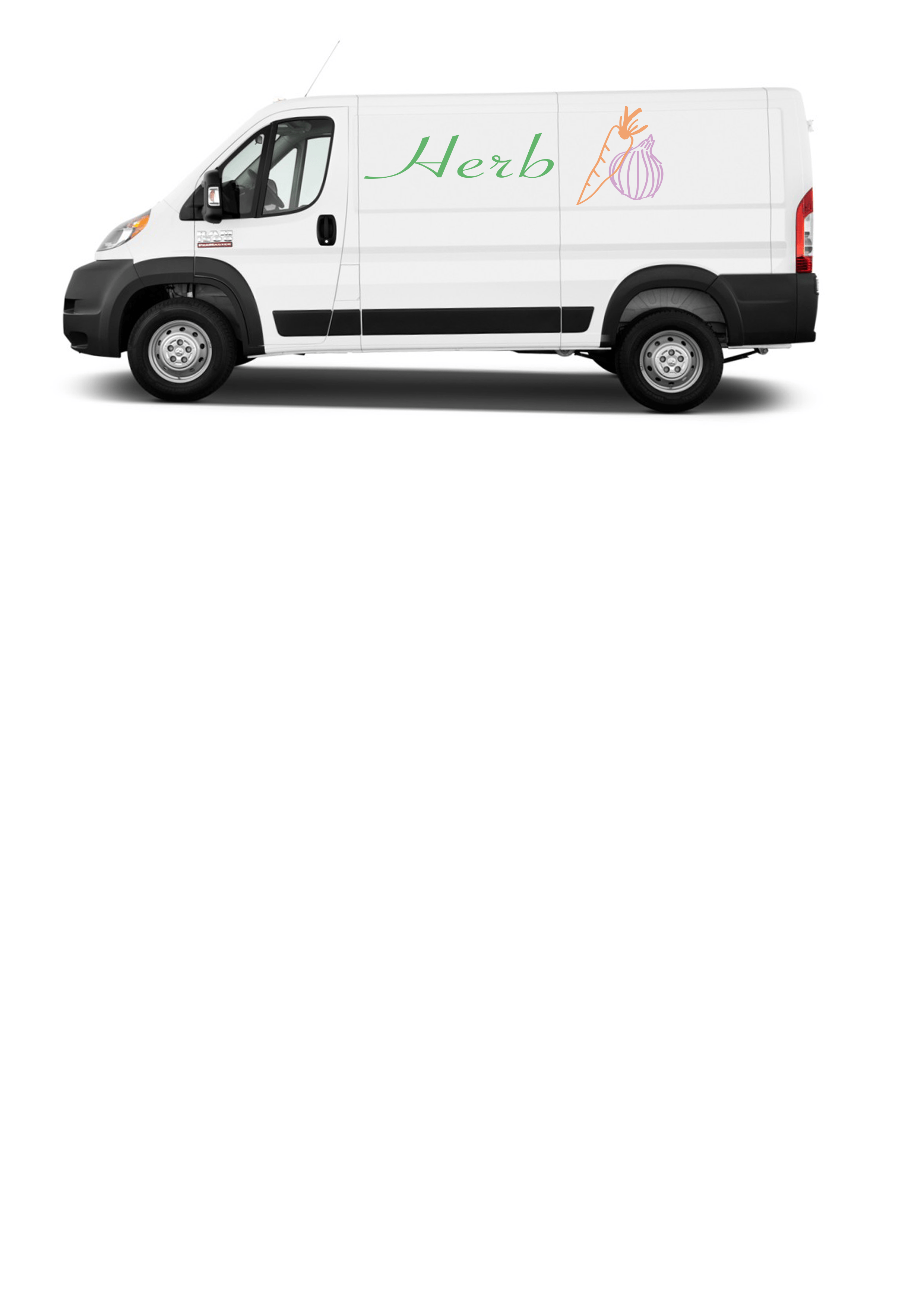
I found this task challenging but enjoyable. It took me many attempts to settle on a final design for my logo and the logo could still be improved, however I am pleased with the final result. Getting used to using Adobe Illustrator has been the most challenging aspect of this task as well as the previous one. My final product is simple but reflects the brief, and typography has been included. The logo would be suitable for an organic grocery company and I have successfully created a style guide.
Evaluation
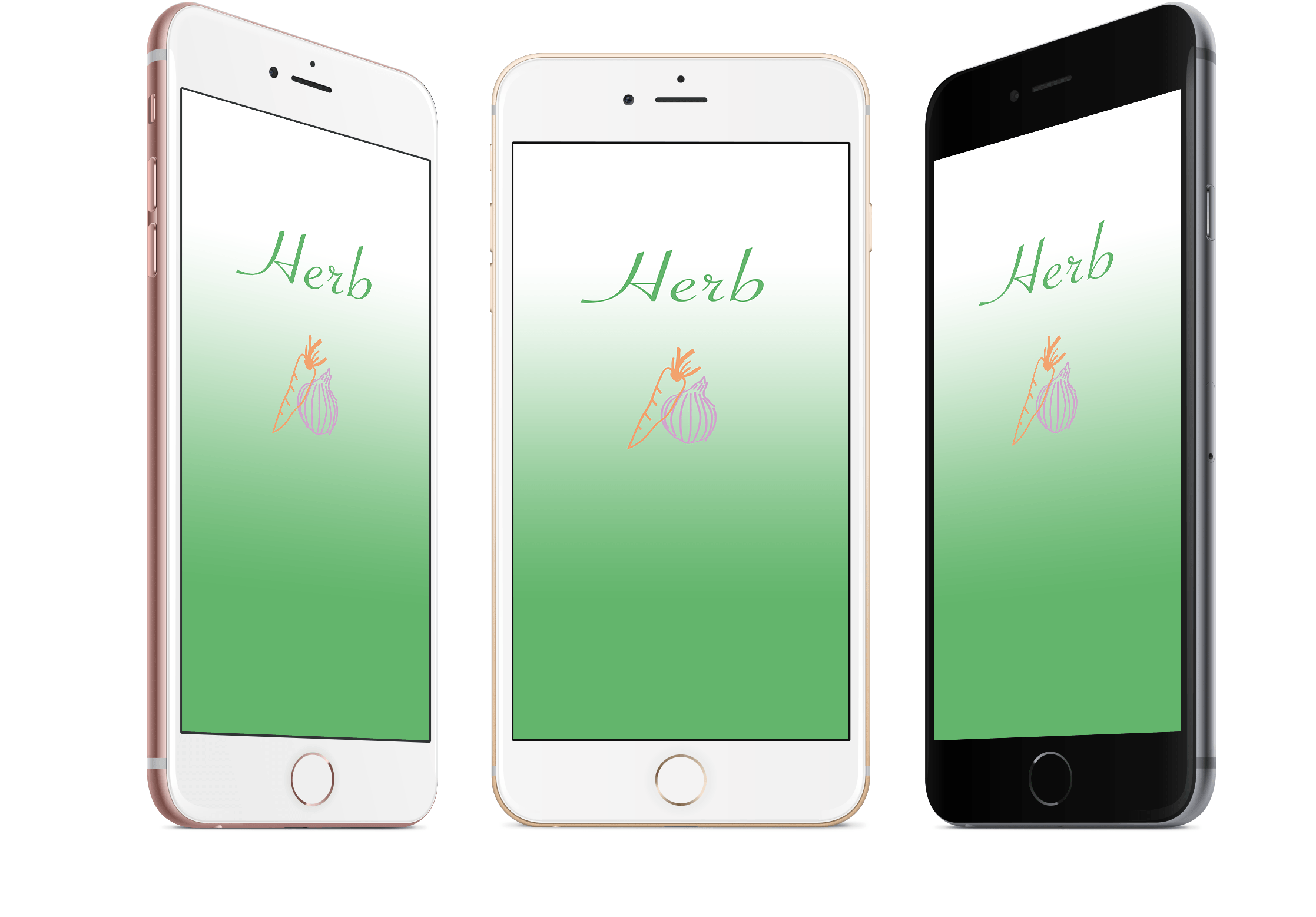
The completed logo is drawn in a way that showcases imperfections. I decided to do this because I believe that it connotes the organic feature of the company and steers away from the idea of mass produced, factory vegetable that are often aesthetically perfect. In addition to this, pastel colours have been used to create a soothing and low-key feel to the logo, which additionally reflects the companies ideologies. The simplicity of the logo suggests the straight-forward service that the company will provide. My logo meets the brief as it communicates the companies ethos through colour scheme and design.